
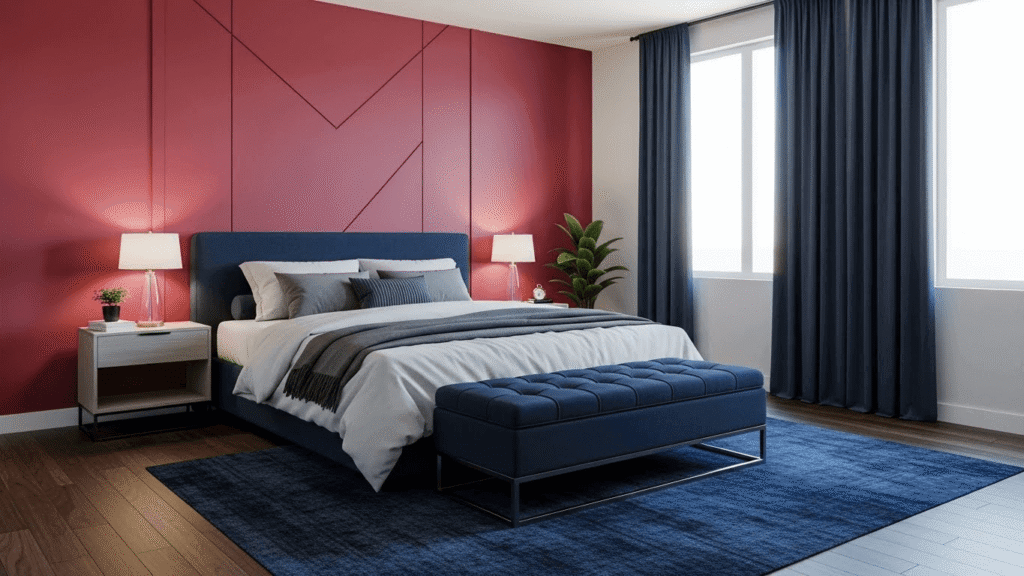
White has shot up seven places to claim the crown for bedroom colours in 2026, showing just how much we’re all craving calm and clarity in our personal spaces. Your bedroom deserves to be more than just a place to sleep; it’s your sanctuary, where the colours you choose can make a real difference to how you feel and how well you rest.
What makes 2026 special? This year is all about creating bedrooms that wrap you in comfort, turning your space into a cocooning retreat that helps you truly unwind. That’s exactly why earthy hues like warm terracotta, soft moss green, clay tones, and muted browns are taking centre stage across bedroom walls, furniture and bedding. These grounding shades work their magic by creating spaces that feel naturally soothing.
Green sits comfortably in second place, continuing its role as the colour that brings nature’s quiet restoration right into your room. Want something a bit more dramatic? Earthy, rich shades of mauve are making their mark as the perfect choice when you’re after a moody colour palette with real sophistication.
Whether you’re drawn to soft minimalism with clean lines or you prefer more expressive colour combinations, this guide will help you discover the perfect bedroom colours that truly reflect your personality and create your ideal retreat for 2026.
The secret to getting your bedroom colours spot on? Choose hues that feel right for you whilst helping you relax and sleep well. Whether you’re drawn to grounding earth tones or dramatic deep shades, your bedroom should feel like your own personal retreat that supports how you want to feel every day.
Earthy and grounding tones for calm bedrooms
Nature-inspired bedroom colours have become the go-to choice for 2026, and it’s easy to see why. These earthy hues don’t just look beautiful; they wrap your room in a calming atmosphere that feels like a comforting embrace the moment you step inside.
Which earthy shades work best in bedrooms?
Terracotta brings the warmth of sun-baked earthenware straight into your bedroom sanctuary. This gorgeous colour spans from burnt orange to deep red and pinky brown, drawn directly from nature’s palette. Choose muted clay terracotta for that quiet warmth that instantly makes any room feel lived-in and loved.

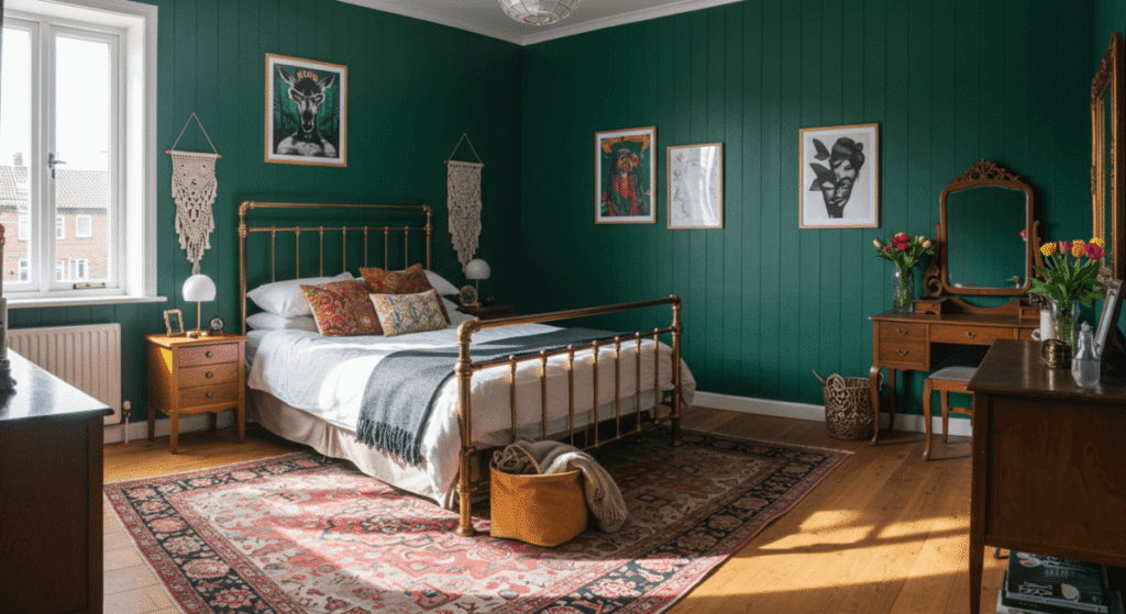
Moss green creates the perfect backdrop that taps into nature’s grounding energy. This rich, earthy shade captures the serenity of quiet woodland, bringing real balance to your space. Dark forest green makes for particularly rich, enveloping bedroom walls that give you nature’s quiet drama whilst making you feel both grounded and energised.
Takeaway Tip: earthy colours work brilliantly as accent walls, try moss green behind your headboard paired with neutral walls for instant impact.
How do earthy tones improve your sleep quality?
Your bedding colour choices do more than just look good; they actively invite calm, balance, and warmth into your sleep space. These muted, organic hues soften your room’s atmosphere, cut through visual clutter, and encourage that slower, more restful rhythm you need for quality sleep.
Stone-coloured bedding offers pure simplicity and calm, creating a neutral base that quiets your senses and makes unwinding before sleep so much easier. Taupe bedding hits that sweet spot between warmth and neutrality, encouraging proper rest whilst offering muted sophistication that blends beautifully with any palette.
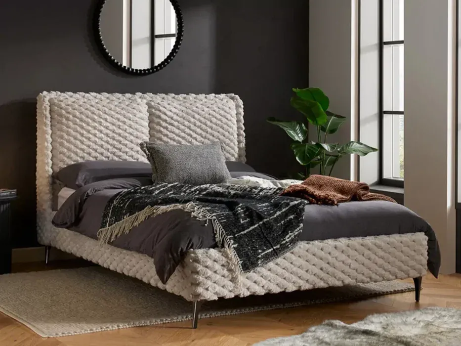
Green works particularly well because it connects you directly with nature’s calming effects. Bedrooms with softer, earthy colours genuinely help people fall asleep more quickly and sleep more deeply.
What textures complement earthy bedroom colours?
Natural materials are your best friend when creating that authentic, earthy bedroom vibe. Wooden furniture brings instant warmth and character, think rich oak or walnut tones that remind you of serene forest trails and peaceful woodland retreats.
Stone surfaces, timber panelling, linen fabrics and limewash finishes add those subtle textures that make earthy tones sing. The real magic happens when materials and textures work together, wrapping your walls and ceiling in the same earthy tone creates that cosy, cocooning feel you’re after.
Don’t forget that pairing wooden furniture with earthy wall colours and plush fabrics gives you the most eye-catching impact whilst supporting better sleep quality.
Soft neutrals that never go out of style
Earthy tones might be having their moment, but neutral colours for bedrooms remain the ultimate choice for timeless elegance. Your neutral bedroom creates a serene haven that wraps you in calm, exactly what you need for quality sleep and relaxation.
Cream, beige and warm white
Cream brings a touch of luxury whilst enhancing every bit of natural light that enters your room. Unlike stark whites that can feel a bit clinical, cream offers warmth and sophistication that just feels right. Beige works beautifully too, creating perfect harmony with every neutral colour and natural surface you can think of.
The beauty of neutral bedroom colours? You can achieve almost any mood you’re after, calm and relaxing, cosy and warm, or light and airy. Colour expert Marianne puts it perfectly: “It helps to think about how the colour might feel if it were a texture. Bedrooms need soft, tactile, comfortable furnishings, and it’s the same with colours.”
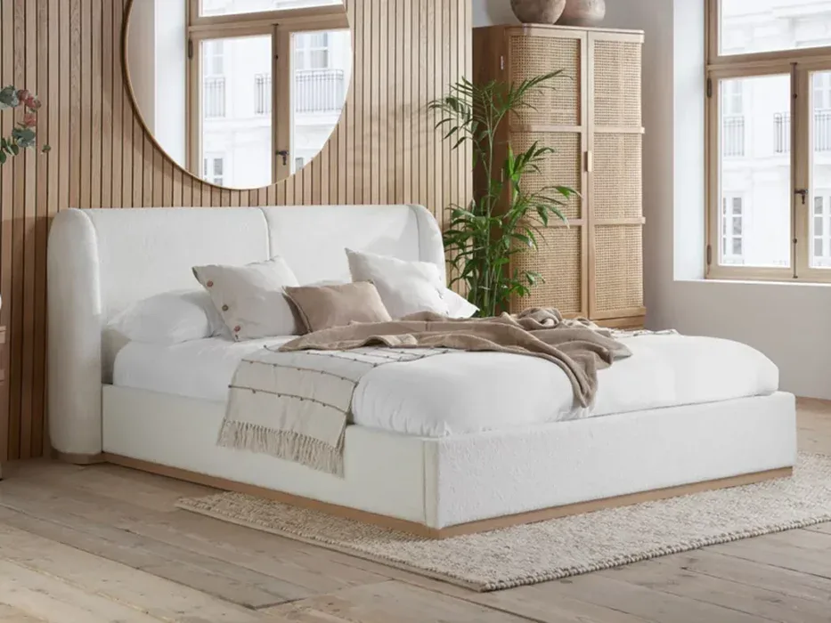
Got a north-facing room that doesn’t get much natural light? Choose warmer hues like cream, buff, or powder colour to create that cosy atmosphere you’re after.
Layering neutrals for depth
Think neutral bedrooms are boring? Not a chance. Layering different shades creates visual interest and real depth. Combining lighter and darker tones of the same colour offers a stylish way to add character without overwhelming your space.
Try mixing gorgeous shades like Turtledove Grey, Raw Cashmere, or Romney Wool across your walls, woodwork, and painted furniture for a sophisticated look. Add different textures through linens, woods, and woven materials to enhance your chosen tones in a subtle, refined way.
Using neutrals as a base for bolder accents
Here’s where neutral bedroom colours really shine; they make the perfect backdrop for your favourite statement pieces. You can introduce your personality through cushions, lampshades, or a vibrant rug without worrying about clashing.
Dark bed linens look absolutely stunning against light bedroom walls. Want to add some colour? Try accent shades like dusky pink, muted pastels, or even emerald green to inject personality whilst keeping that calm foundation that neutrals provide so beautifully.
Bold and expressive colours are making a comeback
Bold colours are having their moment in 2026 bedrooms. After years of playing it safe with gentle neutrals, daring colour choices are making a triumphant return to our sleeping spaces, and we’re here for it.
Burgundy, navy and deep smoky blues
Burgundy continues to steal the show this year, bringing sophisticated moodiness that’s impossible to ignore. You don’t need to paint entire walls to make an impact; a burgundy headboard paired with teal accents creates exactly the kind of striking statement your bedroom deserves.
Deep, moody shades of blue are becoming the go-to choice for 2026 bedrooms, particularly those rich tones with cooler undertones that feel naturally calming. Smoky blues offer that perfect balance, sophisticated and timeless, yet packed with visual impact whilst still letting your space breathe freely.
Navy remains a dependable choice for anyone drawn to darker schemes. More refined than black yet equally dramatic, it’s brilliantly positioned to work with both warm and cool accent colours.
How to balance bold colours with soft furnishings
The secret to decorating with bold colours? Balance is everything. Contrast those strong hues with neutrals like crisp black and white for an upscale feel, or softer natural tones of wood and creamy whites for warmth.
Consider colour blocking rather than painting all four walls in your chosen shade. Deep azure blue looks absolutely stunning beside soft dove grey, whilst vibrant canary yellow pairs beautifully with smoky black accents.
Takeaway Tip: Add natural elements like green foliage or wood accents to counterbalance bold colours and create harmony.
Introduce luxurious fabrics like velvet, silk or faux fur to enhance the richness of your chosen colours. These textures amplify the sophistication whilst adding comfort to your space.
Creating a cocooning effect with darker tones
Dark colours create the most wonderful cocooning effect that actually supports your natural sleep cycles, helping you achieve deeper rest. These rich tones work particularly well in bedrooms because they eliminate visual distractions, allowing your mind to properly wind down.
For a truly enveloping feel, try colour drenching—painting walls, ceiling, trim and even radiators in the same gorgeous hue. Darker tones like navy and burgundy make spaces feel intimate and restful, perfect for rooms you’ll primarily use in the evenings.
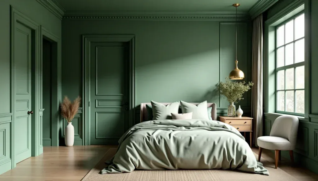
Takeaway Tip: Keep ceilings white or lighter, along with lighter flooring, to balance darker walls and prevent your room from feeling too enclosed.
Playful and modern colour combinations
Mixing bedroom colours is having a real moment in 2026, with designers finally encouraging you to inject more personality and playfulness into your sleeping space. Gone are the days of playing it safe with single-colour schemes.
Mix-and-match bedding trends
Say goodbye to stark white bedding, it’s officially having its moment in the corner. What’s taking its place? Warmer, more personal approaches that let your personality shine through. Jessica Hanley, Founder of Piglet in Bed, puts it perfectly: “People are cottoning on to the fact that stark white bedding and perfectly matched, minimalist sets can feel a bit cold and impersonal.”
Your new palette? Think butter yellows paired with dusty pinks, or soft greens mixed with cosy neutrals. These combinations feel uniquely personal whilst creating that inviting atmosphere you want when you slip into bed each night.
Grown-up primary colours in 2026
Here’s something exciting, primary colours are back, but not as you remember them from school. These sophisticated interpretations swap bright classroom hues for deeper, more refined versions. We’re talking rich mustard yellows instead of screaming sunshine, deep burgundy reds rather than fire-engine bright, and navy blues that feel grown-up and considered.
The beauty? You get all the playfulness of primaries with the sophistication your adult bedroom deserves.
Which approach works best for your space?
Colour blocking gives you immediate visual impact without needing to hang a single piece of art. Try highlighting architectural features like alcoves or window frames; it’s a simple way to add character to your bedroom sanctuary.
But here’s the decision you’ll face: accent wall or full-room treatment? The wall behind your bed makes the perfect candidate for an accent wall, creating that focal point without overwhelming your space. Want something more dramatic? Colour drenching – painting everything the same gorgeous hue – creates that cocooning effect that helps you wind down properly.
Takeaway Tip: Start small with colour blocking on one feature, then build up your confidence for bolder treatments.
Conclusion
Choosing the right colours for your bedroom stands as perhaps the most impactful decision when creating your personal sanctuary. Whether you prefer the grounding embrace of earthy tones, the timeless elegance of soft neutrals, the dramatic depth of bold hues, or the playful energy of modern combinations, your colour choices significantly influence both your sleep quality and emotional wellbeing.
White has undoubtedly claimed its throne at the top of 2026 bedroom colour trends, closely followed by various shades of green. This shift reflects our collective yearning for spaces that nurture and cocoon us, providing respite from the outside world. Certainly, the appeal of terracotta, moss green, and clay tones lies in their ability to connect us with nature while creating visually soothing environments.
Though trends come and go, neutral bedrooms remain eternally stylish. These versatile palettes offer the perfect backdrop for personalisation, allowing you to express yourself through carefully selected accents and textures. Meanwhile, bolder options like burgundy and navy have made their triumphant return, bringing depth and character to sleeping spaces for those seeking more dramatic surroundings.
The 2026 bedroom moves away from rigid design rules toward more expressive, personalised spaces. Mix-and-match bedding, sophisticated interpretations of primary colours, and strategic colour blocking all offer exciting ways to infuse your personality into your sleep sanctuary.
Ultimately, your perfect bedroom palette should feel right for you. Trust your instincts when selecting colours that make you feel simultaneously energised and calm. After all, your bedroom serves as your most intimate space, a daily retreat deserving of colours that speak to your soul and support your wellbeing through every season of life.
Key Takeaways
Ready to create your perfect bedroom sanctuary? Here are the essential colour insights that’ll help you get there in 2026:
• Earthy tones are your sleep’s best friend – Terracotta, moss green, and clay shades bring that grounding, nature-inspired feel that helps you unwind faster and drift off more easily.
• White’s having its moment – Clean whites and soft neutrals give you timeless elegance whilst creating the perfect canvas for your favourite accent colours and textures.
• Bold colours are back with sophistication – Deep burgundy, navy, and smoky blues create that cocooning feel you’re after, especially when you balance them with soft furnishings and natural touches.
• Mix-and-match bedding is the new black – Forget stark minimalism. Warmer, playful combinations of butter yellows, dusty pinks, and soft greens make your sleep space feel properly personal and inviting.
• Colour blocking creates instant wow factor – Whether you go for a statement accent wall or drench the whole room in one gorgeous hue, you’ll create focal points that don’t overwhelm your peaceful retreat.
FAQs
Q1. What are the top bedroom colour trends for 2026?
White has taken the lead, followed closely by various shades of green. Earthy tones like terracotta, moss green, and clay are also popular, reflecting a desire for calming, nature-inspired spaces.
Q2. How can I incorporate bold colours into my bedroom without overwhelming the space?
Consider using bold colours for accent walls or through colour blocking techniques. Balance strong hues with neutral tones and soft furnishings. You can also introduce bold colours through accessories like cushions or artwork.
Q3. Are neutral colours still in style for bedrooms?
Yes, neutral colours remain timeless and versatile for bedrooms. They create a serene atmosphere and serve as an excellent base for adding personalised touches through accents and textures.
Q4. What colour combinations work well for a modern bedroom in 2026?
Modern bedrooms are embracing playful combinations. Try pairing sophisticated versions of primary colours, like deep blue with mustard yellow. Mix-and-match bedding in warm, inviting shades is also trending.
Q5. How can colour choices affect sleep quality in the bedroom?
Colour choices can significantly impact sleep quality. Earthy and neutral tones promote relaxation and better sleep. Darker hues like navy or burgundy can create a cocooning effect, helping to eliminate visual distractions and encourage deeper rest.